· Education · 7 min read
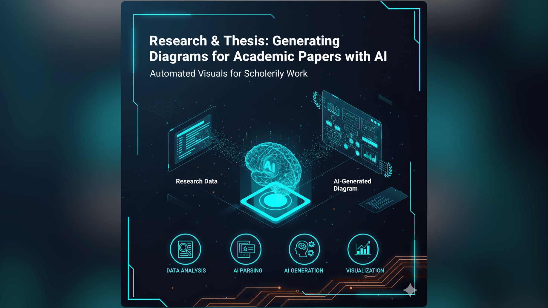
Research & Thesis: Generating Diagrams for Academic Papers with AI
Stop fighting with PowerPoint or LaTeX TikZ for your methodology visuals. Learn how an AI diagram generator for research papers can transform your complex neural networks and experimental workflows into publishable vector graphics.
The deadline for your conference paper or your final thesis submission is approaching. You have written the abstract. You have analyzed the data. You have cited your sources.
But there is a gaping hole in the “Methodology” section. You need a diagram.
You need a visual that explains your novel neural network architecture or your complex experimental setup. You try to draw it in PowerPoint but the boxes won’t align. You try MS Paint but it looks pixelated and amateur. You consider learning a complex tool like LaTeX TiKz but you don’t have three days to debug syntax errors just to draw a few circles.
This is the panic that every graduate student and researcher knows. We spend years becoming experts in our field but we are rarely trained in graphic design. Yet we are judged on the visual quality of our papers.
We built AI Diagram Maker to solve this academic bottleneck. We believe that your diagrams should look as professional as your research without costing you hours of precious writing time. This guide explores how using an ai diagram generator for research papers helps you visualize complex concepts instantly.
The Challenge: Visualizing Complex Concepts in Academic Writing
Academic writing is dense. It is full of jargon and abstract concepts. A good diagram is often the only thing that keeps a reviewer from getting lost.
Why Diagrams are Crucial for Clarifying Research and Theses
A diagram serves as an anchor. When you are describing a multi-step chemical process or a distributed computing consensus algorithm, text alone is often insufficient. The reader has to hold the entire structure in their working memory.
A visual map offloads that cognitive effort. It allows the reviewer to see the “shape” of your argument immediately. Papers with clear professional diagrams are cited more often because they are easier to understand. They communicate competence.
The Time-Consuming Nature of Manual Diagram Creation for Students
The problem is that creating these visuals is a massive time sink.
Students often spend more time fighting with the formatting of a flowchart than they do designing the logic of the experiment. You align the arrow. You change the font size. You realize the box is too small for the text. You resize the box. Now the arrow is detached.
This fiddling is a distraction: you should be focusing on your hypothesis and your discussion, not on becoming a vector graphics artist.
The Need for Professional-Looking Scientific Diagrams in Academic Papers
There is also the issue of standards. Top tier journals and conferences like IEEE or Nature have strict requirements.
They will reject papers with blurry screenshots or amateurish drawings. They demand high resolution. They demand crisp lines. They demand legibility. Achieving this standard with basic tools is hard. Achieving it with professional design tools like Adobe Illustrator is expensive and has a steep learning curve.
Introducing AI Diagram Maker: Your AI Diagram Generator for Research Papers
We provide a third option. Instead of drawing pixels, you describe the concept.
From Concept to Diagram: How AI Assists Academic Visualizations
AI Diagram Maker works by interpreting your textual description of a system or process.
You might be working on a Computer Science thesis. You can describe your system: “A client sends data to a Load Balancer which distributes it to three Worker Nodes. The Workers write to a shared Sharded Database.”
Our AI parses this. It identifies the components. It understands the hierarchy. It draws the connections. It produces a clean structured diagram that looks like it belongs in a textbook.
Transforming Textual Descriptions into Clear, Publishable Diagrams
The engine is designed to handle the complexity of research topics. It can map out decision trees. It can visualize software architectures. It can flow out experimental procedures.
Because it generates vector graphics, the output is crisp. It scales perfectly whether it is viewed on a phone or printed on a large poster.
Key Advantage: Focus on Research, Not on Drawing Software Mechanics
This tool shifts your focus back to the content. You are the expert on the “what” and the “why.” The AI handles the “how” of the drawing.
If you realize your methodology has a flaw, you don’t have to redraw the chart. You just update the text description: “Add a validation step before the data analysis phase.” The diagram updates instantly. This allows your visuals to evolve alongside your research draft.
Practical Applications for AI-Generated Diagrams in Academia
We see students and professors using this tool across a wide range of disciplines.
Illustrating Experimental Workflows and Methodologies (Flowcharts)
Every scientific paper needs a methodology section. A Process Flow Diagram (PFD) is the standard way to show this.
You can use our ai flowchart maker to map out your steps. “Sample collection. Centrifuge. Extract supernatant. PCR amplification. Data logging.” The AI aligns these steps perfectly. It creates a linear professional flow that tells the story of your experiment clearly.
Visualizing System Architectures for Computer Science Theses
For CS students, drawing system architecture is a daily requirement. You can use the AI System Architecture Generator to create High-Level Designs (HLDs). You can visualize cloud setups, neural network layers, or network topologies.
“Input Layer connects to two Hidden Layers which connect to an Output Layer.” The AI draws the structure, saving you from manually placing every single neuron or server icon.
Explaining Complex Algorithms and Data Structures
If you are proposing a new algorithm, describing it in pseudo-code is good, but showing it as a diagram is better. You can describe the logic flow including loops and decision branches. The AI renders the logic path, helping readers visualize the execution flow of your code.
Creating Conceptual Models for Social Sciences and Humanities
It is not just for hard sciences. Social science researchers often need to show relationships between concepts.
“Socioeconomic status influences education level which in turn influences lifetime income.” You can map these causal relationships easily, creating a conceptual model that summarizes your theoretical framework.
The AI Diagram Maker Workflow for Academic Excellence
Here is how to use the tool to upgrade your next paper.
Step 1: Describing Your Concept or Process in Text
Open the tool. Look at your messy notes or your rough abstract. Type the structure into the input box. Be explicit about the relationships: “Component A is connected to Component B. Component B sends data to Component C.”
Step 2: AI Generates the Initial Scientific Diagram
Click generate. The AI builds the visual representation. It uses a clean, neutral style that is appropriate for academic publications: it avoids flashy, distracting colors and focuses on structure and clarity.
Step 3: Refining and Customizing for Academic Standards
Review the output. Does it match your research exactly? Use the chat refinement to tweak it. “Label the arrow between A and B as ‘Data Stream’.” “Group the bottom three nodes into a box labeled ‘Control Group’.” You can ensure the terminology matches your paper perfectly.
Step 4: Exporting in High-Resolution Formats for Publications
This is critical. You cannot use a low quality JPEG in a PDF submission: it will look fuzzy when zoomed in.
We allow you to export in SVG (Scalable Vector Graphics) format. SVG is resolution independent. You can resize it to fit a single column or a full page spread and the text will remain razor sharp. It works perfectly with LaTeX and Microsoft Word.
Benefits for Students and Researchers
- Saves Valuable Time: Every hour you save on drawing is an hour you can spend analyzing results or writing your discussion. It helps you hit that conference deadline without pulling an all-nighter just to format images.
- Ensures Consistency and Professionalism: When all your diagrams are generated by the same engine, your thesis has a consistent look and feel. This creates a subconscious impression of quality and rigor for the reviewer.
- Simplifies Complex Visualizations: It reduces the barrier to adding visuals. If creating a diagram is easy, you will include more of them.
- Aids in Clarity and Comprehension: A clear diagram is the most effective way to transfer an idea from your brain to the reader’s brain.
By using AI Diagram Maker, you are not just making your paper prettier: you are making it more impactful. You are ensuring that your contribution to science is understood.