· Education · 8 min read
How to Learn Programming Faster with AI Diagram Generators: Visual Guide to Algorithms & System Design
See how AI diagram tools transform plain English descriptions into visual diagrams for practical programming scenarios. Learn through real examples of binary search visualization, OAuth authentication flows, and Java vs Python runtime comparisons , all generated from simple text prompts.
Learning programming concepts from text-heavy documentation is slow and frustrating. Whether you’re preparing for technical interviews, mastering a new framework, or explaining complex systems to your team, translating words into mental models takes hours of effort.
This guide demonstrates how AI-powered diagram generators accelerate programming education through visual learning. We’ll show you real examples of learning algorithms, authentication protocols, and language comparisons—all by converting simple text prompts into professional diagrams in seconds.
If you’d like to experiment with these concepts as you read, there’s a free AI diagram generator available that you can use to visualize any programming concept instantly.
Why Visual Learning Works for Programming Concepts
Research shows visual learning improves retention by 65% compared to text-only materials. For developers learning complex systems, this translates to:
Better Pattern Recognition: Side-by-side comparisons (Java vs Python runtimes, REST vs GraphQL) reveal architectural trade-offs that would take paragraphs to explain in text.
Reduced Cognitive Load: Sequence diagrams show entire flows (like OAuth authentication) at once, eliminating the mental effort of piecing together steps from documentation.
Faster Interview Recall: Your brain remembers the spatial position of algorithm steps, making whiteboard explanations more natural than reciting memorized pseudocode.
The challenge? Creating these diagrams manually takes time and design skills. AI diagram generators address this by converting text descriptions into professional visuals.
Real-World Learning Examples with AI Diagrams
Example 1: Mastering Algorithms for Interview Prep
The Challenge: You’re preparing for a technical interview and need to understand binary search algorithm quickly. Reading documentation gives you the theory, but you struggle to visualize how it actually works.
The Solution: Ask AI Diagram Maker in plain English
Input:
Explain binary search algorithm
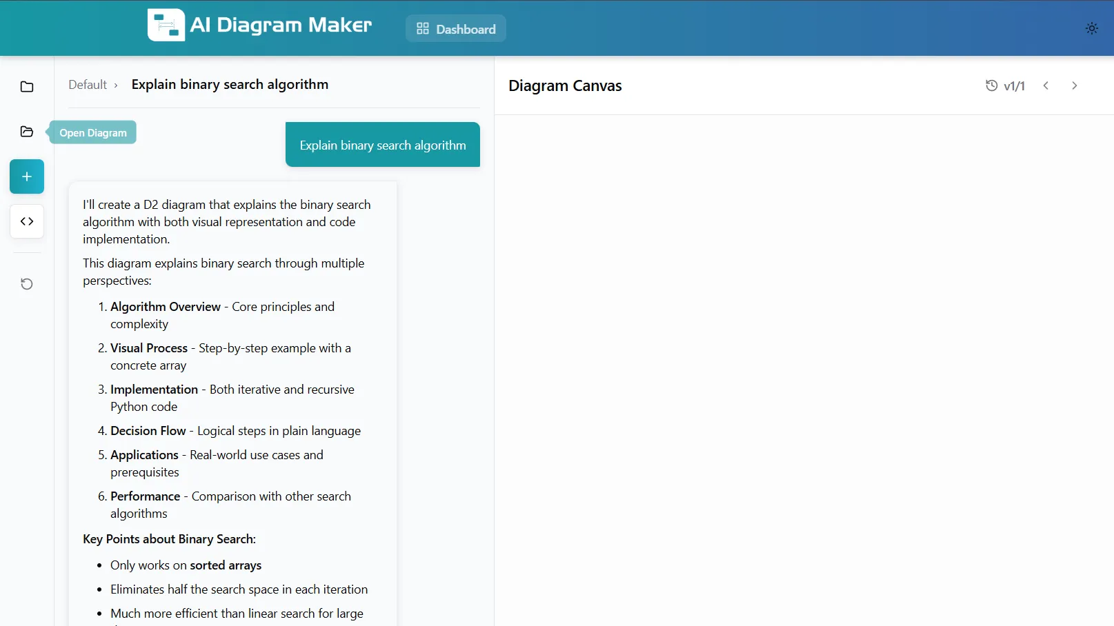
Output:
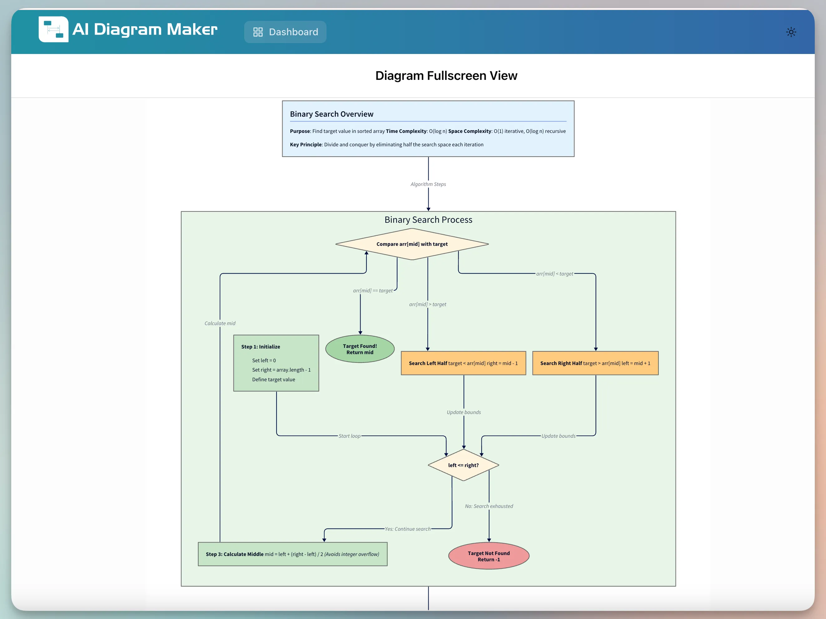
What the AI Generated:
The diagram shows the complete binary search process in one visual:
- Algorithm Overview: Purpose (find target value in sorted array), Time Complexity O(log n), Space Complexity O(1), Key Principle (divide and conquer by eliminating half the search space each iteration)
- Binary Search Process Flow: Complete flowchart showing the algorithm execution from start to finish
- Step 1: Initialize: Setup with sorted array, set left = 0, right = array length - 1, initialize mid pointer
- Step 2: Calculate Middle: Formula mid = left + (right - left) // 2 shown to prevent overflow
- Decision Points: Compare array[mid] with target, branching to search left half (target < array[mid]) or search right half (target > array[mid])
- Termination Conditions: Target found (return mid) or target not found (return -1) when search space exhausted
Use Cases: This visualization technique works for any algorithm or data structure—sorting algorithms, graph traversals, dynamic programming, tree operations, or hash table mechanics. Use it to quickly grasp computational complexity, identify optimization opportunities, or create teaching materials for technical concepts that benefit from step-by-step visual breakdown.
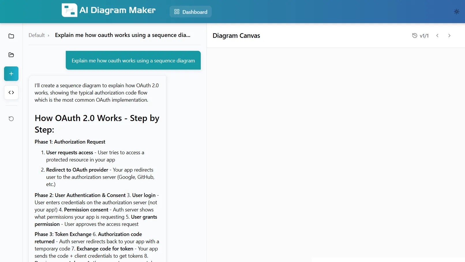
Example 2: Understanding OAuth for Authentication Implementation
The Challenge: Your team needs to implement “Sign in with Google” but OAuth 2.0 documentation is dense and confusing. You need to understand the entire flow before writing code.
The Solution: Visualize the authentication sequence
Input:
Explain how oauth works using a sequence diagram
Output:
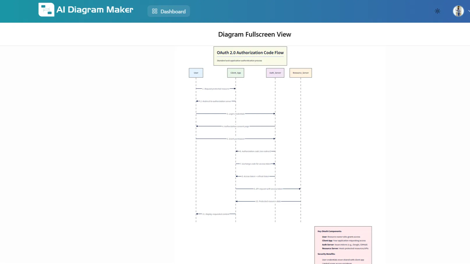
What the AI Generated:
A complete sequence diagram showing all 11 steps of OAuth 2.0 Authorization Code Flow:
- User → Client App: Request access to protected resource
- Client App → User: Redirect to authorization server (Google/GitHub)
- User → Auth Server: Login credentials
- Auth Server → User: Consent screen (permission request)
- User → Auth Server: Grant permission
- Auth Server → Client App: Authorization code returned
- Client App → Auth Server: Exchange code for access token
- Auth Server → Client App: Access token + refresh token issued
- Client App → Resource Server: API request with access token
- Resource Server → Resource Server: Validate token
- Resource Server → Client App: Protected data returned
Key Security Benefits Visualized:
- User password never exposed to your app (stays with Google)
- Access tokens have limited scope (only requested permissions)
- Tokens are revocable (user maintains control)
- Refresh tokens enable long sessions without re-authentication
Use Cases: Sequence diagrams excel at visualizing any multi-party interaction—API request flows, microservice communication, database transaction sequences, payment processing pipelines, or distributed system protocols. Use this approach whenever you need to understand timing, dependencies, and data exchange between components, especially for debugging integration issues or designing new system interactions.
Example 3: Comparing Programming Languages for Technology Decisions
The Challenge: Your team is debating whether to use Java or Python for a new microservice. You need to understand the fundamental differences in how they execute code to make an informed decision.
The Solution: Generate a side-by-side runtime comparison
Input:
Textual description of the comparison between Java and Python runtimes is provided as input.
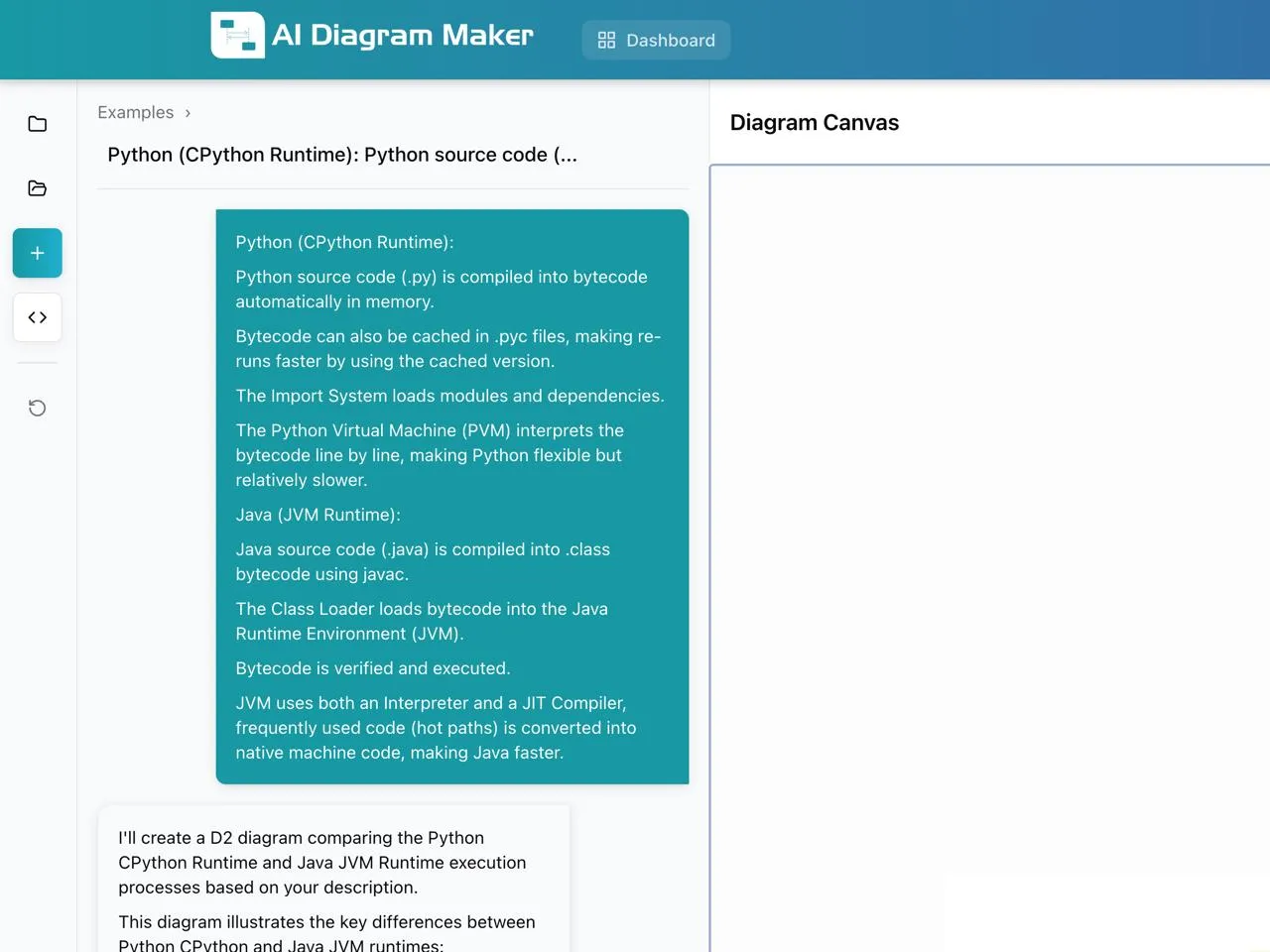
Output:
What the AI Generated:
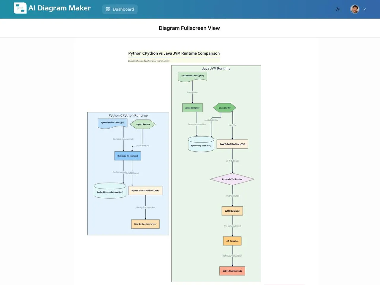
The AI transformed the textual description into a side-by-side visual comparison that makes the differences immediately clear:
- Visual Layout: Two distinct colored panels (blue for Python, green for Java) positioned side-by-side for instant comparison
- Execution Flow: Each runtime shown as a vertical flowchart with arrows connecting each stage, making the sequential process easy to follow
- Component Shapes: Different shapes distinguish component types—rectangles for files, rounded boxes for processes, cylinders for memory/storage
- Parallel Structure: Both flows aligned vertically so you can compare corresponding stages at the same level (e.g., Python’s “Import System” vs Java’s “javac Compiler”)
- Visual Hierarchy: The flow progresses top-to-bottom, naturally guiding your eye through the execution pipeline
Why This Visual Format Works Better:
Instead of reading paragraphs describing each runtime separately, you can scan the diagram in seconds and immediately grasp:
- Python’s simpler, shorter pipeline vs Java’s more complex multi-stage process
- Where compilation happens (in-memory for Python vs explicit files for Java)
- The fundamental difference in execution models (interpretation vs JIT compilation)
The spatial arrangement and color coding create a mental model that’s far easier to recall during technical discussions or interviews than memorizing text descriptions.
Use Cases: Side-by-side comparisons clarify trade-offs for any technical decision—database types (SQL vs NoSQL), architectural patterns (monolith vs microservices), deployment strategies (containers vs serverless), testing frameworks, or cloud providers. This technique transforms abstract feature lists into concrete visual differences, making it invaluable for architecture reviews, vendor evaluations, or explaining technical decisions to stakeholders.
How to Use AI Diagram Generators Effectively
Tips for Writing Effective Prompts
Start simple, then iterate: Begin with “Explain binary search” → then refine with “Add time complexity analysis” → “Show edge cases”
Use comparisons: “Show difference between BFS and DFS” or “Compare REST API vs GraphQL” helps you understand trade-offs faster than learning each separately
Add real-world context: “How would Netflix use a load balancer?” makes abstract concepts concrete and memorable for interviews
Be specific about output: Request “sequence diagram” or “flowchart with code” to get the visualization format that matches your learning style
When AI Diagrams Work Best (and When They Don’t)
Ideal Use Cases:
- Learning standard algorithms and data structures
- Understanding authentication flows and security protocols
- Comparing technology options for decision-making
- Creating documentation for common architectural patterns
- Interview preparation and technical communication
Current Limitations:
- May oversimplify highly complex, proprietary systems
- Generated diagrams should be verified against official documentation
- Works best for well-documented concepts with established patterns
- Not a replacement for hands-on coding practice
Verification Tips: Cross-reference diagrams with official docs, ask the AI to explain its reasoning, test the concepts in code, and iterate with clarifying questions if something seems off.
The Learning Impact
Research on visual learning shows consistent benefits:
Retention: Studies demonstrate 65% higher retention with visual aids compared to text-only materials. For technical concepts like algorithms and system architecture, visual representation leverages spatial memory patterns that make recall more natural.
Comprehension Speed: Visual diagrams eliminate the mental overhead of piecing together information from multiple text sources. What might take hours of reading documentation can often be understood in minutes when presented visually.
Interview Performance: Technical candidates who can draw and explain system architectures or algorithms visually demonstrate clearer thinking and communication—skills that interviewers value beyond pure coding ability.
Conclusion
AI-generated diagrams accelerate programming education by transforming text-heavy documentation into visual understanding. While they have limitations and should be verified, they’re valuable tools for learning algorithms, understanding authentication flows, and making architectural decisions. Try generating diagrams for your next learning challenge at aidiagrammaker.com.
Common Questions About AI Diagram Generators
Will AI diagrams help me in technical interviews?
Yes. Candidates who can draw and explain algorithms or system architectures visually demonstrate clearer thinking and communication skills—qualities interviewers value highly. Visual explanations during whiteboard sessions show you understand not just the code, but the complete system or algorithm flow.
Can I use these diagrams for teaching and documentation?
Yes. AI-generated diagrams are exportable as PNG, SVG, or diagram code (D2, Mermaid), making them suitable for presentations, technical documentation, and training materials. However, verify technical accuracy before using in production documentation, especially for security-critical systems.
How do AI diagram generators compare to manual diagramming tools?
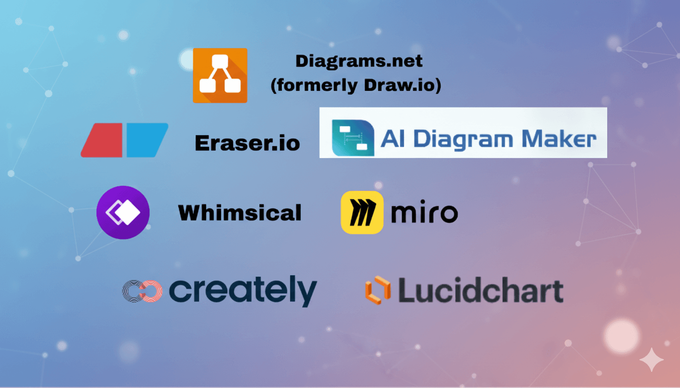
AI generators create diagrams from text descriptions, eliminating the need for manual drawing and layout decisions. This is faster for exploration and learning. However, manual tools like Lucidchart or draw.io offer more precise control for production-quality documentation. Many developers use AI diagrams for initial learning, then refine in traditional tools if needed for formal documentation.
What are the limitations of AI-generated diagrams?
AI diagrams work best for well-documented, standard concepts (common algorithms, established protocols like OAuth, popular architectures). They may oversimplify complex proprietary systems or emerging technologies with limited documentation. Always verify generated diagrams against official sources, especially for security-critical implementations. AI tools are excellent learning aids but shouldn’t replace hands-on coding practice or official documentation review.