· Software Development · 5 min read
Refactoring Spaghetti Code: Visualizing Dependencies First
This guide explains how to visualize code dependencies to effectively refactor complex legacy code, focusing on generating and analyzing dependency graphs to plan strategic changes.
Refactoring is scary. You open a file called OrderManager.java or utils.py. It is 4000 lines long. It was written five years ago by a developer who “did not believe in comments.” You need to add a feature. Or maybe you need to extract a microservice. But every time you touch a line of code, something seemingly unrelated breaks. You change a variable in the payment logic, and the email notification system crashes.
This is Spaghetti Code. Everything is tangled. Everything is connected. The mistake most developers make is diving in with a machete. They start deleting code hoping for the best. The smart approach is to map the territory first. You need to visualize code dependencies before you sever them.
The Danger of “Refactoring in the Dark”
Refactoring without a map is like doing electrical work in a dark basement with wet hands. You are going to get shocked.
Breaking Hidden Dependencies
The insidious thing about legacy code is the hidden coupling. Class A calls Class B. That is obvious. But Class B modifies a global static variable that Class C reads. That is invisible. If you delete Class B, you break Class C. But your IDE might not warn you about that runtime dependency.
The Fear of Touching Legacy Code
This risk creates fear. The team becomes afraid of the codebase. “Do not touch that module. It works, and nobody knows why.” This fear paralyzes innovation. You stop paying down technical debt. The rot spreads.
Mapping the Spaghetti: Step-by-Step
We need to turn the fear into understanding. We need to generate a Dependency Graph.
Identifying the Core Classes/Modules
Start by identifying the “Blast Radius.” Which files are you planning to touch? Select that group of files. Maybe it is the entire billing package.
Importing Code via GitHub Integration
You do not need to install complex static analysis tools that take hours to configure. Navigate to the code icon in the bottom left corner. This opens the repository connection wizard.
- Public Repos: Paste the GitHub URL of the open-source library you are auditing.
- Private Repos: Connect your GitHub account securely to access your internal projects. Once connected, you can browse the file tree. Select the specific files in the Billing module you want to visualize. This pulls the source directly without manual copy-pasting.
Generating the Dependency Graph (Class Diagram)
Our AI parses the code. It looks for every import. It looks for every instantiation. It looks for every method call. It draws a box for every class. It draws an arrow for every dependency.
Analyzing the Visual for Refactoring Opportunities
Suddenly, the mess has a shape.
Spotting Cycles and Tight Coupling
You will see the tangles immediately. “Look at InvoiceGenerator. It has arrows pointing to it from everywhere. It is a central hub.” “Look at Customer and Order. They point at each other. That is a circular dependency. That is why we cannot separate them.”
Identifying “God Objects” Visually
You will see the “God Objects.” These are the massive classes that sit in the middle of the diagram like a black hole pulling everything in. Seeing this confirms your strategy. “We need to break up OrderManager first.”
Planning the Refactor with “To-Be” Diagrams
Now you can plan the surgery.
Describing the Ideal State in Text
Do not just start coding. Write a prompt describing the clean architecture you want. “Create a diagram where OrderManager only handles order logic. Move the email logic to a separate NotificationService. Move the payment logic to PaymentGateway. The OrderManager should depend on these services via interfaces.”
Diagram Explanation:
Overview: The diagram shows a cleaned-up, interface-driven design where responsibilities are separated:
OrderManagerfocuses solely on order orchestration;NotificationServiceandPaymentGatewayhandle email/notification and payment responsibilities respectively.OrderManager: Coordinates order flow (create/update/cancel/get). It depends on
INotificationServiceandIPaymentGatewayinterfaces rather than concrete implementations, enabling mocking and easier testing.NotificationService: Encapsulates all email/SMS-related logic (for example,
sendOrderConfirmation(order)andsendShippingNotification(order)). Concrete providers such asEmailProviderandSMSProviderimplementINotificationService.PaymentGateway: Handles payment operations and transaction logging (for example,
processPayment(amount, method),refundPayment(transactionId),validatePaymentMethod(method)). Concrete adapters implementIPaymentGateway.Order (domain): A plain data structure representing order state and items; used by
OrderManagerand service implementations.
Comparing “As-Is” vs “To-Be”
Generate this “To-Be” diagram. Put it next to the “As-Is” spaghetti diagram. The difference is your roadmap. You now have a clear list of tasks. “Extract Email Logic.” “Extract Payment Interface.”
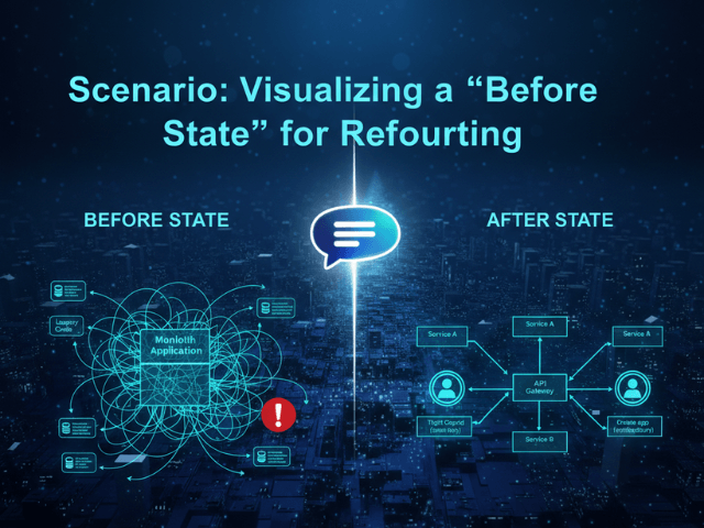
Scenario: Decoupling a Payment Service
Let us say you want to move from a monolithic database call to an external API.
Moving from direct DB access to API calls
The diagram shows that your Checkout class currently talks directly to the CreditCardTable. You can visually plan the insertion of an adapter. “I will put a StripeAdapter box here. The Checkout class will point to the Adapter, not the Table.” This visual planning gives you the confidence to start cutting. You are not guessing anymore. You are executing a plan. To see an example of visualizing a “before state” for refactoring, check out our scenario page: Visualizing a “Before State” for Refactoring.
The Programmable Diagram: A Developer’s Guide to D2 and Text-Based Visuals
For a comprehensive understanding of how text-based diagramming tools can revolutionize your approach to visualizing and managing complex codebases, explore our guide: The Programmable Diagram: A Developer’s Guide to D2 and Text-Based Visuals.