· Glossary · 5 min read
What is a System Architecture Diagram?
What is a architecture Diagram? A complete definition of this essential UML chart, detailing how it visualizes API calls, time, and system interactions.
I remember the first time I joined a really large software project. I sat down at my desk, opened the laptop, and cloned the repository. I stared at the file structure for about an hour. There were hundreds of folders. There were services named things like “Hydra” and “Kraken” that meant absolutely nothing to me.
I felt completely lost.
I turned to the senior developer next to me and asked if there was a map. I wanted to know how these things actually connected to each other. He just shrugged and told me to read the code.
That is a terrible way to onboard someone.
A System Architecture Diagram is that map. It is probably the most critical piece of documentation for any engineering team because it is the only thing that explains the “what” and the “where” before you get bogged down in the “how.” It is the bird’s eye view of your entire digital world. Without one, you are basically trying to navigate a city by looking at individual bricks.
TL;DR
- The Definition: A System Architecture Diagram is a visual model that shows the high level structure of a software system.
- The Components: It is made up of the major building blocks like servers and databases and the lines that connect them.
- The Purpose: It serves as a single source of truth to align developers, managers, and stakeholders on how the system is built.
- The Modern Way: Instead of drawing these manually and letting them get outdated, we can now generate them directly from the code to ensure they are always accurate.
Definition
At its core, a System Architecture Diagram is a blueprint.
It identifies the main components of your system and the relationships between them. It is not about classes or functions or variable names. It is about the big rocks. We are talking about the web server. The database. The external payment API. The message queue.
It abstracts away the complexity of the code to show the logical design.
There are different levels of detail here. You might have heard of the C4 model. That is a popular way to structure these diagrams. It starts with a “Context” view that is very broad and zooms in all the way to a “Code” view. But generally, when someone asks for an architecture diagram, they want to see the Container level. They want to see how the apps talk to the databases.
Key Elements of an Architecture Diagram
If you look at a good architecture diagram, it is not just a random collection of clipart. It usually has three specific types of elements that tell the story.
Components
These are the nouns of your system. They are the boxes. In a modern stack, these might be your React frontend, your Python backend, your PostgreSQL database, and your Redis cache. They are the places where data lives or where data is processed.
Connectors
These are the lines that tie the boxes together. But a good diagram does not just draw a line. It tells you what that line is. Is it an HTTPS request? Is it a TCP connection? Is it a Kafka event stream? The connector explains how the components talk.
Boundaries
This is one people often forget, but I think it is crucial. Boundaries are boxes that group other boxes. For example, you might draw a big box labeled “AWS Cloud” around all your servers to show they are hosted in the cloud. Or you might have a “VPC” boundary to show network isolation. It helps define where the system starts and stops.
The Purpose of an Architecture Diagram
Why do we spend time making these? It is not just to make the documentation look pretty.
Shared Understanding
This is the big one. If I think the system works one way, and you think it works another way, we are going to write incompatible code. A diagram forces us to agree on reality. It aligns the technical team with the non technical stakeholders. A Product Manager can look at the boxes and understand why the server costs are high.
Strategic Planning
You cannot fix what you cannot see. When you lay out the entire architecture visually, you start to spot the problems. You might notice that the entire system depends on one tiny, fragile database. That is a risk. You see it on the diagram, and you can plan to fix it.
Developer Onboarding
Going back to my earlier story, if that senior dev had just handed me an architecture diagram, I would have understood the system in ten minutes. It gives new team members a mental model so they know where their code fits into the bigger picture.
The Fastest Way to Create Architecture Diagrams
Traditionally, drawing these was a chore. You would open Visio or some web tool and drag boxes around for hours. The problem with that approach is that the moment you finish the drawing, it is already dead. The engineering team changes the code the next day, and now your beautiful diagram is a lie.
This is why I am such a big believer in AI and code based generation.
With tools like AIDiagramMaker, you have two better options. You can describe the system in plain English if you are just brainstorming. “I have a web app connected to a SQL database and a payment service.”
Or, even better, you can connect your GitHub repository. The tool scans your actual code. It sees the imports. It sees the API calls. It generates a diagram that reflects the ground truth of what is actually running in production. It is accurate because it comes from the source.
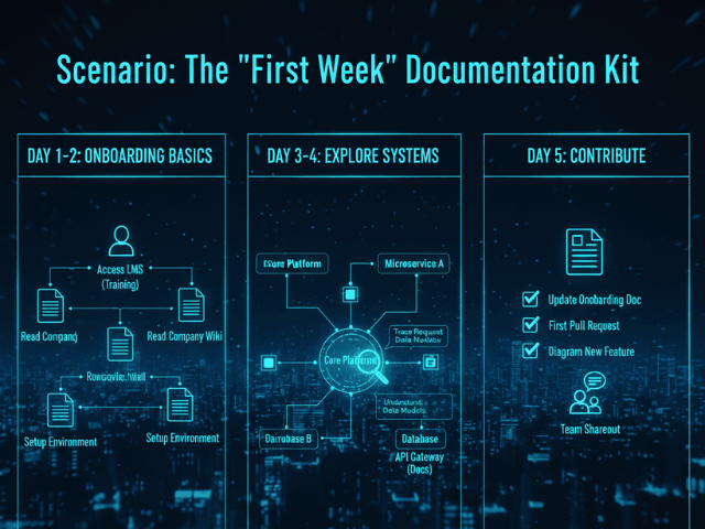
See it in a Real-World Scenario
We have a detailed walkthrough that shows exactly how to do this for a typical web application.
- Documenting a SaaS Architecture in Minutes with AI Check out this scenario to see us build a diagram for a full stack app with a database and microservices.
- The Ultimate Guide to AI Diagram Generation Return to the main guide to learn more about how AI is changing the way we document software.