· Scenario · 7 min read
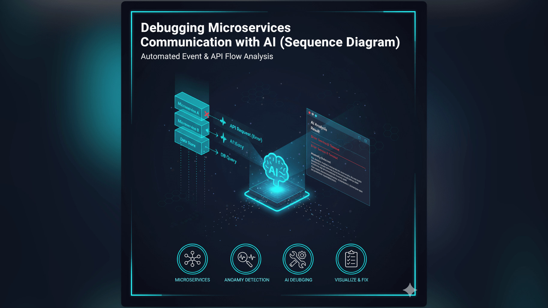
Scenario: Debugging Microservices Communication with AI (Sequence Diagram)
When microservices fail in production, logs can be overwhelming. Learn how an AI sequence diagram generator helps you reconstruct distributed transactions and isolate API call failures visually in seconds.
It is 2 AM on a Saturday. Your pager goes off.
You groggily open your laptop. The alerting dashboard is screaming red: “Checkout Service High Error Rate.”
You open the logs. It is a wall of text: [Error] Connection timed out [Info] Processing order #99281 [Warn] Inventory service latency high
You are looking at logs from five different microservices. Service A talks to Service B which puts a message on a queue for Service C. Somewhere in that chain the request is dying. But where? And why?
You are trying to build a mental map of this distributed transaction while you are half asleep. You are grepping for request IDs. You are jumping between browser tabs.
This is not debugging. This is archaeology. And every minute you spend digging is a minute the site is broken. You need to see the flow. You need a Sequence Diagram.
The Real-Life Challenge: Navigating the Labyrinth of Microservice Interactions
Microservices are great for scale but they are terrible for observability. In a monolith, a function call is simple: you click “Go to Definition.” In a distributed system, a “function call” is an HTTP request over a network. It can fail, it can timeout, and it can get lost.
The Complexity of Tracing API Call Failures Across Distributed Systems
When a user clicks “Buy,” that one action triggers a cascade of events. The API Gateway talks to the Auth Service. The Auth Service talks to the User DB. The API Gateway then talks to the Order Service which talks to the Payment Gateway and the Inventory Service.
If the Payment Gateway fails, does the Inventory Service know to rollback the stock reservation? Tracing this logic path is incredibly complex. If you cannot see the sequence of events, you cannot find the bug.
The Pain Point: Diagnosing Issues Without a Clear Visual Flow
Most developers rely on their memory of how the system should work. “I think the Order Service calls Inventory first.” But memories are faulty and code changes. If your mental model is wrong, your debugging is wrong. You might spend an hour fixing the Inventory Service only to realize the error was actually coming from the Auth Service.
Why Manual Sequence Diagramming is Impractical During Debugging
In a production outage, you do not have time to open Visio. You do not have time to drag and drop lifelines and draw arrows manually. The sheer effort of drawing the diagram prevents you from using one. So you go back to staring at the raw logs, hoping to spot a pattern in the chaos.
The Old Way: Sifting Through Logs and Guessing Interaction Flows is Slow
We have all been there:
- Manually Correlating Log Entries from Multiple Services: You copy a Correlation ID and paste it into Splunk or Datadog. You get a list of 50 log lines sorted by time. You are manually constructing the sequence in your head. It is slow and tedious.
- Drawing Out Potential Call Flows by Hand Under Pressure: Maybe you grab a pen and a notepad. You start scribbling lines: “A -> B. B -> C. Error.” But then you see another log entry: “Wait, B also calls D in parallel?” You cross out your drawing. It becomes a mess.
- The Frustration of Blind Debugging: You are poking at the system hoping to find the soft spot. It is inefficient and leads to “patchwork fixes” that don’t address the root cause.
Introducing AI Diagram Maker: Your AI Sequence Diagram Generator for Debugging
We built AI Diagram Maker to be your visual aid during the fire.
Describe the Interaction, Get a Visual Trace
We allow you to “reconstruct the crime scene” instantly. You simply describe the flow as you see it in the logs: “Service A called Service B. Service B timed out after 3000ms. Service A returned 500.” Our AI turns that text into a structured UML sequence diagram.
The Power of Text to Sequence Diagram for “Tracing the API call failure”
This visualization changes the game. Suddenly you can see the gap. You see the arrow go from A to B. You see the massive vertical gap representing the timeout. You see the lack of a return arrow. The visual makes the failure mode obvious: “Oh, Service B never responded. It must be a deadlock.”
Rapidly Isolate Problem Areas in Microservice Communication
You can use the tool to map out the “Expected” flow versus the “Actual” flow. Generate a diagram of how it should work, generate a diagram of what the logs say actually happened, and put them side by side. The difference reveals the bug.
AI Diagram Maker Workflow: Tracing an API Call Failure, Step-by-Step
Here is how you can use this tool to resolve your next incident faster.
Step 1: Describing the Suspected API Call and Involved Services
You have the logs open. Switch to our AI Sequence Diagram Generator. Start typing what you know: “User requests Checkout. API Gateway forwards to Order Service. Order Service calls Inventory.”
Step 2: AI Generates an Initial Sequence Diagram of the Expected Flow
Hit generate. You now have a clear map of the happy path. This anchors your understanding. You know who the players are and their respective lifelines.
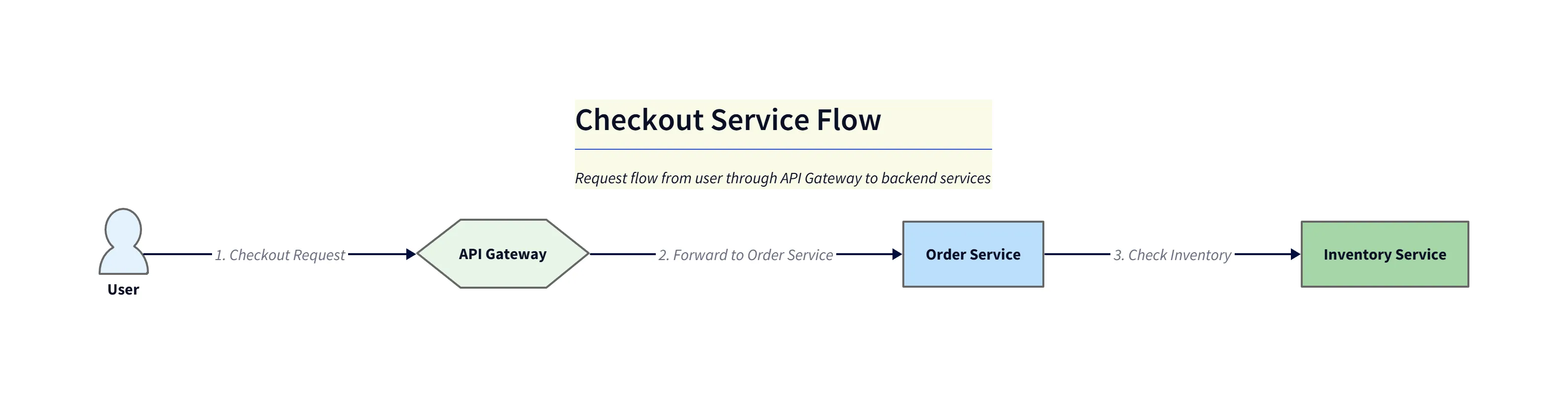
Diagram explanation:
- Happy path visualization: Shows
User->API Gateway->Order Service->Inventory Serviceinteractions with expected request/response timing. - Lifelines and activations: Activation bars illustrate where each service is active; the diagram makes it easy to see the normal call and return sequence for checkout.
- Use in triage: This output anchors your mental model so you can compare expected behavior against actual logs quickly.
Step 3: Refining with Actual Log Snippets or Failure Conditions
Now add the failure: “Modify the diagram. The Inventory Service call takes 5 seconds. The Order Service has a 2 second timeout. Show the Order Service canceling the request and returning an error to the Gateway.”
The AI updates the diagram. It draws a large activation bar for the Inventory Service and an error arrow from the Order Service happening before the Inventory Service finishes.
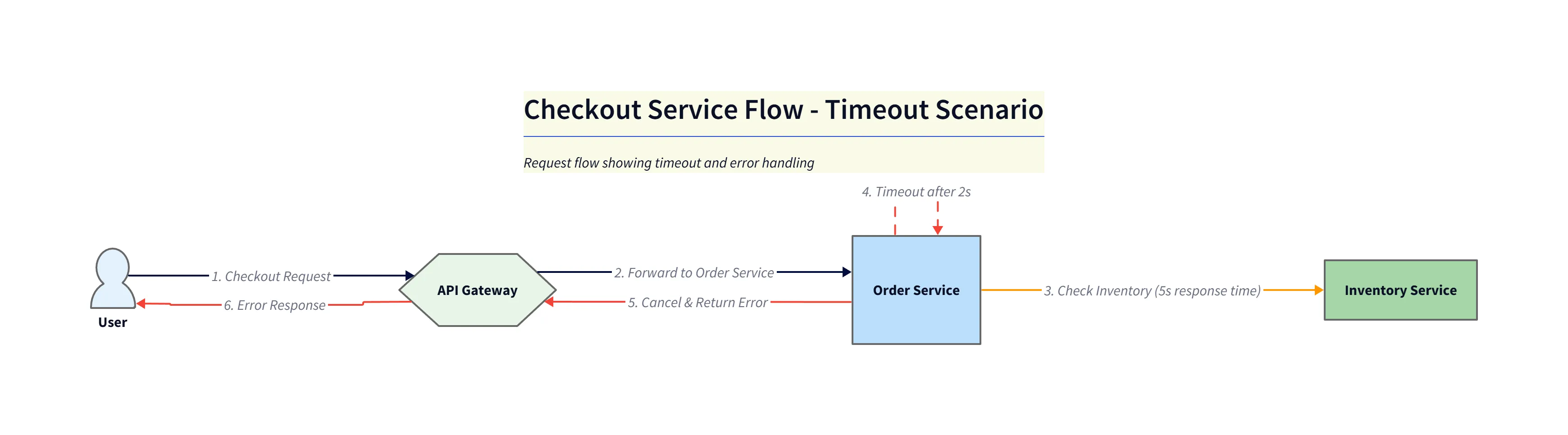
Diagram explanation:
- Timeout visualization: Highlights the Inventory Service activation extending beyond the Order Service timeout, making the mismatch obvious.
- Error flow: Shows the Order Service cancelling the outstanding call and returning an error (e.g.,
503) back through theAPI Gatewayto theUser. - Postmortem aid: This diagram becomes a concise artifact for incident reports, showing both timing and fail-paths clearly.
Step 4: Identifying the Point of Failure Visually
You look at the diagram. It is crystal clear. The Inventory Service is too slow. The Order Service is too impatient. You have identified the root cause: it is a timeout configuration mismatch. You didn’t need to read code; you just needed to visualize the timing.
The Output: A Clear, Actionable Visual for API Call Failure Diagnosis
Once the fire is out, this diagram becomes a valuable artifact.
- Pinpoint the Exact Service Causing the Issue: You paste the diagram into the Post-Mortem incident report. “Here is what went wrong.”
- Facilitates Faster Root Cause Analysis: Everyone in the review meeting understands instantly. The diagram shows the race condition or timeout visually.
- Enhances Communication: The DevOps team sees the timeout issue while the Backend team sees the latency issue. The diagram bridges the gap.
Who Benefits Most from AI-Driven Debugging Visuals?
- Site Reliability Engineers (SREs) and DevOps Teams: Visuals help you understand the system architecture fast when you are debugging code you didn’t write.
- Backend Developers: Verify your rollback logic and error handling paths visually.
- Incident Responders: Speed is life. Generating a diagram in 30 seconds gives you clarity when you need it most.
Ready to streamline your debugging? Experience the AI Sequence Diagram Generator. The next time the pager goes off, don’t just stare at the logs. Reconstruct the flow and get back to sleep sooner. You can learn more about the complete workflow in The Developer’s Guide to AI Diagramming.