· Methodology · 3 min read
Documentation Rot: Why Static Images Fail and Text Wins
Discover why manual diagrams always become outdated and how "living documentation" tools solve this. Learn to treat diagrams as code to eliminate friction and keep your visual documentation in sync with your actual system.

We need to talk about the lie we tell ourselves every sprint planning meeting.
“We will update the documentation later.”
We never do. And if we do it is usually a half-hearted effort. We open the wiki. We see the diagram from six months ago. It shows a system architecture that vaguely resembles what we had before the big refactor.
We look at it. We sigh. We close the tab.
This phenomenon is called Documentation Rot. It is the slow decay of truth in your knowledge base. It happens because the friction of updating documentation is higher than the perceived value of doing it.
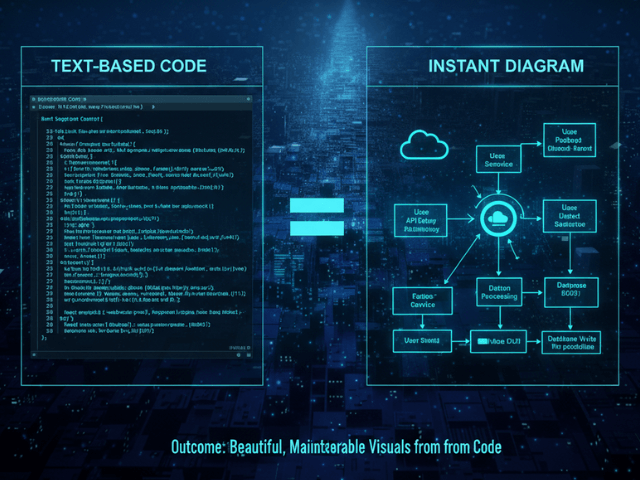
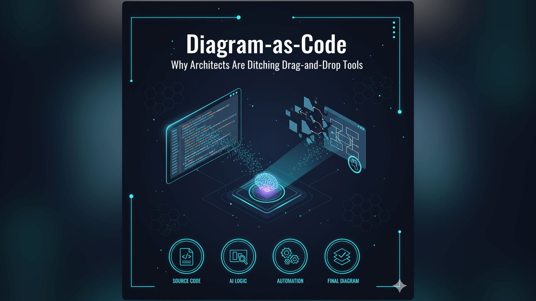
This guide argues that the root cause of this rot is the file format itself. Static images are dead ends. To keep documentation alive we need to switch to living documentation tools that treat diagrams as text.
The Lifecycle of a Diagram
Let’s trace the sad life of a typical architecture diagram.
Day 1: Perfect Alignment
You spend four hours in a drawing tool. You align every box. You pick a nice color palette. You export a high-resolution PNG. You paste it into Confluence. It is beautiful. It is accurate. It is the pride of the engineering team.
Day 30: The Code Drift Begins
A developer adds a Redis cache to speed up the API. They implement it in code. They deploy it.
They know they should update the diagram. But the source file is on your laptop not theirs. Or maybe it is in a shared folder but they don’t have the login for the drawing tool.
They think “I will ask the Tech Lead to update it.” They forget. The drift has begun.
Day 90: The Diagram is a Lie
Three months later a new hire joins. They look at the diagram. They see a direct connection between the API and the Database.
They write code assuming there is no cache. They introduce a bug because they didn’t know about the cache invalidation logic.
The diagram isn’t just useless now. It is actively harmful. It misled the developer. The team loses trust in the wiki. They stop reading it. The documentation is effectively dead.
Why Drag-and-Drop Tools Encourage Rot
The problem isn’t laziness. It is friction.
The Friction of Opening a Design Tool
Drag-and-drop tools are heavy. They are separate applications. They require a context switch.
If I am coding in VS Code I don’t want to open a browser log in to a SaaS app find the right file wait for the canvas to load and then start dragging boxes. That is ten minutes of distraction.
The “Sunk Cost” of Manual Layouts
When you draw manually you invest time in the layout. You spend time making the arrows straight.
When you need to add a new box you have to move everything else to make room. You have to break your perfect layout.
Psychologically we resist breaking things we spent time perfecting. So we avoid making the change. The “artistic” nature of the tool becomes a barrier to accuracy.
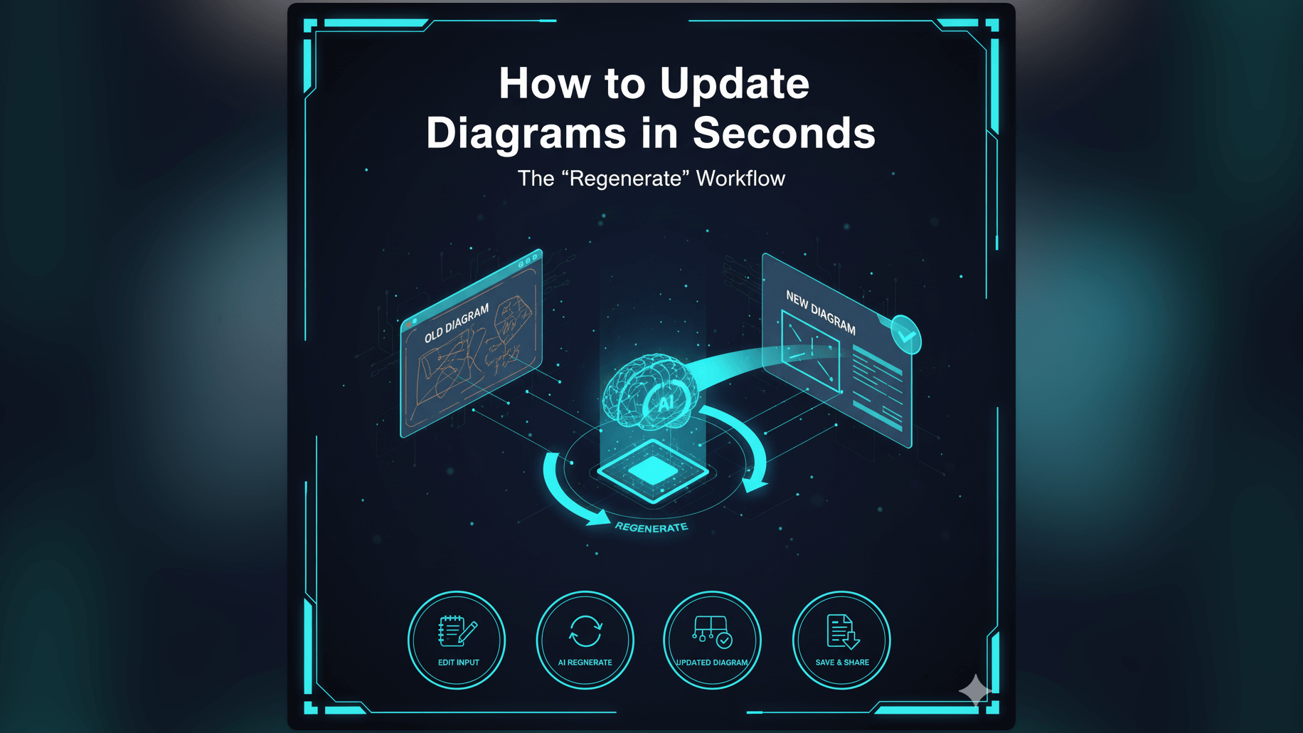
The Solution: Treat Diagrams as Code
The solution is to lower the friction to zero.
Low Friction Updates via Text Input
If the diagram is defined by text updating it is as easy as editing a line of code.