· Comparison · 8 min read
Best MCP Diagram Tools for Cursor and Claude Code
Compare the top MCP diagram tools for Cursor and Claude Code, including AI Diagram Maker, draw.io, Excalidraw, and Mermaid.
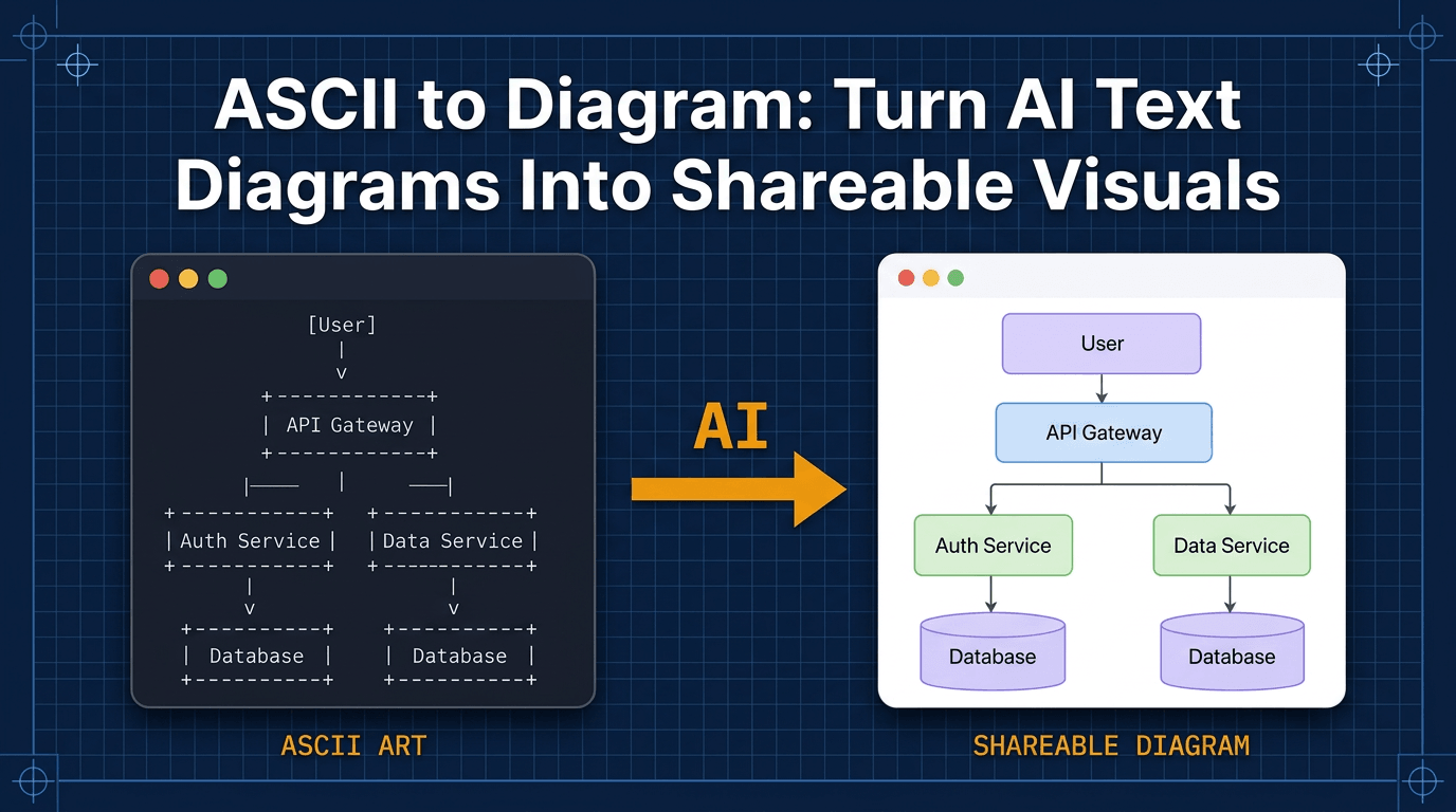
If you have ever paused mid-review, mid-debug session, or mid-doc write-up and thought, “This would be so much easier with a diagram,” you are not alone. The hard part usually is not understanding the system. It is breaking your flow long enough to open another tool, sketch it out, export it, and get back to work.
That is why MCP feels so useful in practice. It lets your AI assistant generate diagrams inside Cursor, Claude Code, or VS Code, right when you need them.
I tested four MCP diagram servers with the same prompts so you can see how they behave in real work, not just in feature lists. If you are deciding between AI Diagram Maker, draw.io, Excalidraw, and Mermaid, this guide should help you choose faster.
What is the Model Context Protocol?
The Model Context Protocol is an open standard that lets AI assistants talk to external tools through a consistent interface. In plain English, it is what allows your editor and a diagram tool to work together without a custom integration for every combination.
How MCP Brings Diagrams Into Your Editor
Your editor runs an MCP client. Diagram tools expose MCP servers. When you ask your assistant to create a diagram, the editor sends the request to the server, gets the result back, and renders it directly in your workflow.
That matters because you stay in context. Instead of switching to a separate app, you can generate a diagram while the code, prompt, and task are still fresh in your head.
If you want to understand more about how this diagram generation workflow in Cursor and Claude Code works under the hood, I wrote a deeper technical walkthrough.
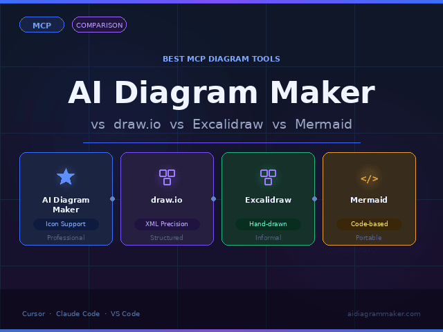
The 4 Best MCP Diagram Tools
I used the same two prompts across all four tools so the differences are easier to see.
Prompt 1: User calls login API → validate credentials → if success redirect to home, if failure redirect to login. Use icons
Prompt 2: Create diagram for React Frontend talks to Node API. API uses Redis and Postgres. Everything runs in Docker. Use icons.
These cover two common jobs: explaining logic flow and sketching system architecture.
Quick Setup (Add to mcp.json)
If you are using Cursor, setup is straightforward:
Cursor example setup
Step 1: Open Cursor settings, go to Tools and MCP, and click Add Custom MCP.
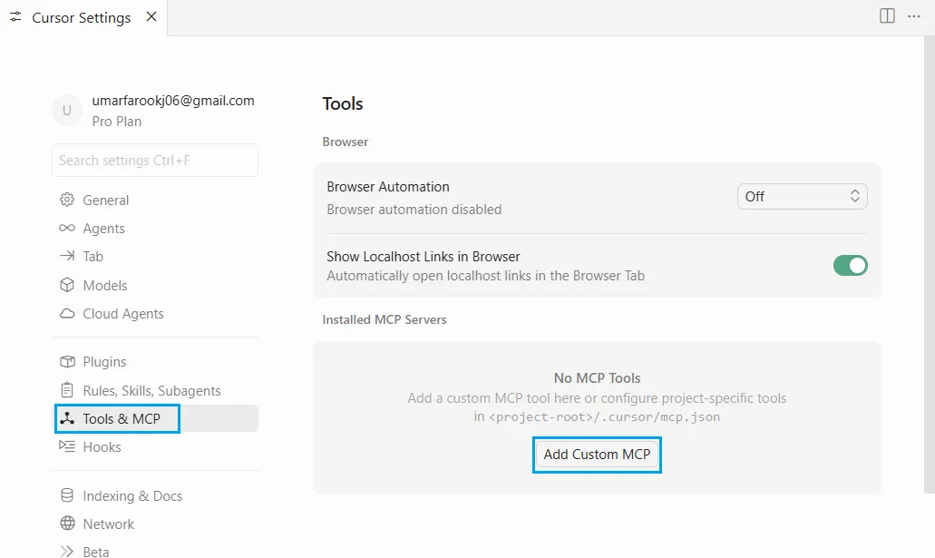
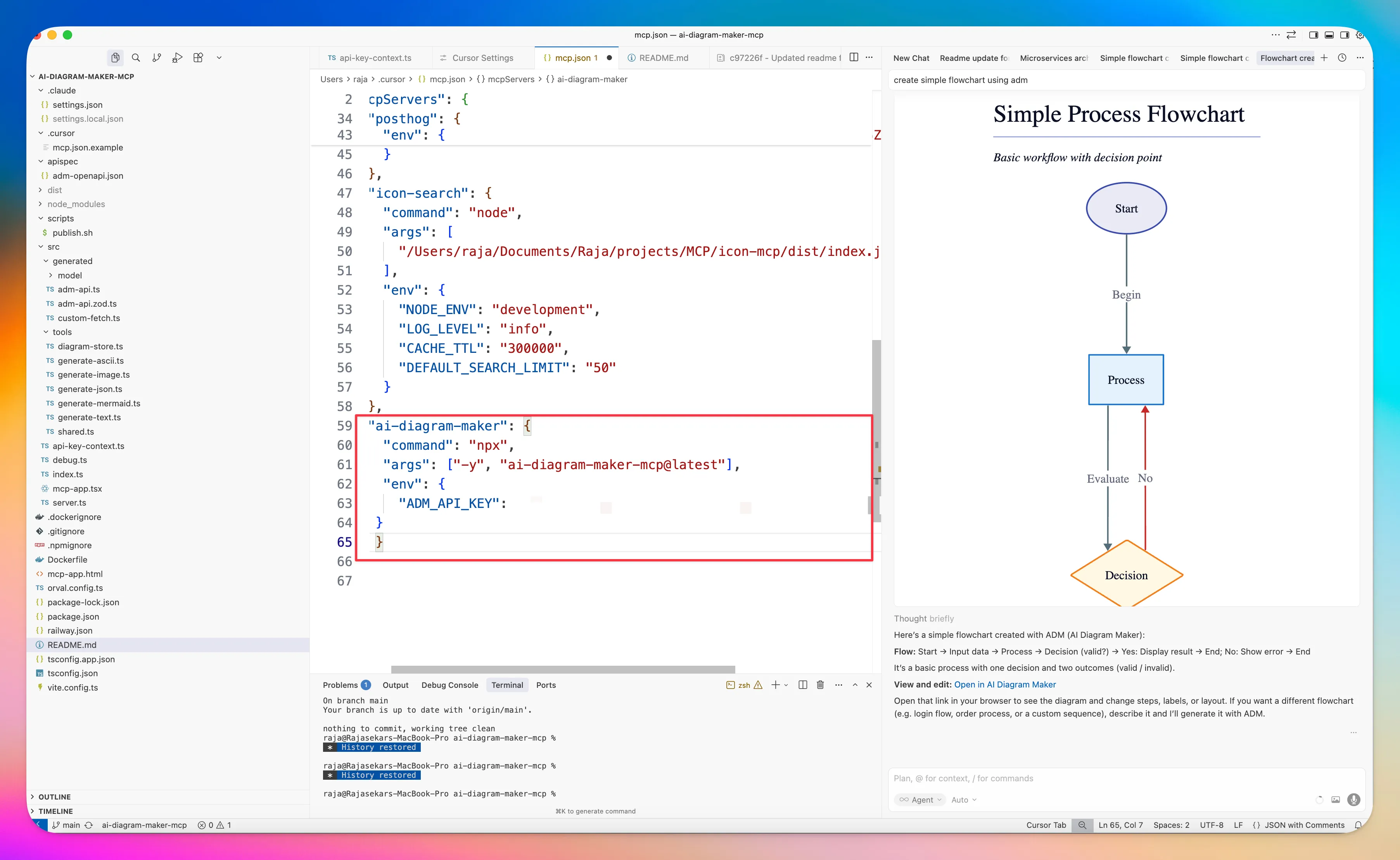
Step 2: Paste the config into mcp.json, replace YOUR_API_KEY, and save.
Tip: You can also edit Cursor’s MCP config at ~/.cursor/mcp.json.
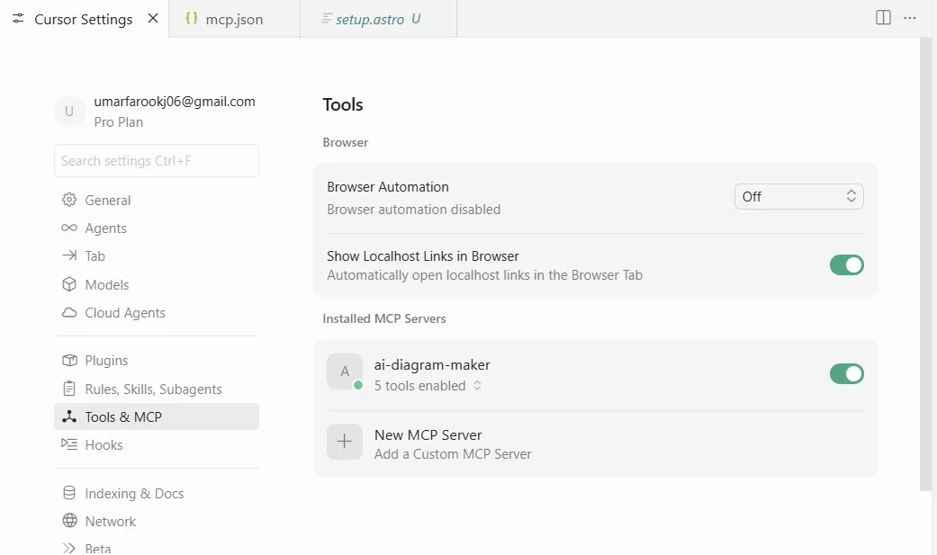
Step 3: After setup, the installed MCP servers will appear in the list.
AI Diagram Maker
Add this under mcpServers:
{
  "ai-diagram-maker": {
    "command": "npx",
    "args": ["-y", "ai-diagram-maker-mcp@latest"],
    "env": {
      "ADM_API_KEY": "YOUR_API_KEY",
      "ADM_DEBUG": "true"
    }
  }
}
draw.io
Add this under mcpServers:
{
  "drawio": {
    "url": "https://mcp.draw.io/mcp"
  }
}
Excalidraw
Add this under mcpServers:
{
  "excalidraw": {
    "url": "https://mcp.excalidraw.com/mcp"
  }
}
Mermaid
Add this under mcpServers:
{
  "mermaid-mcp": {
    "transport": "http",
    "url": "https://mcp.mermaid.ai/mcp"
  }
}
Full Example (All Four)
Here is a single mcp.json you can use as a starting point:
{
  "mcpServers": {
    "ai-diagram-maker": {
      "command": "npx",
      "args": ["-y", "ai-diagram-maker-mcp@latest"],
      "env": {
        "ADM_API_KEY": "YOUR_API_KEY",
        "ADM_DEBUG": "true"
      }
    },
    "drawio": {
      "url": "https://mcp.draw.io/mcp"
    },
    "excalidraw": {
      "url": "https://mcp.excalidraw.com/mcp"
    },
    "mermaid-mcp": {
      "transport": "http",
      "url": "https://mcp.mermaid.ai/mcp"
    }
  }
}
AI Diagram Maker: Fastest Route to Polished Diagrams
AI Diagram Maker is built for software diagrams, and that shows in the output. It handles common engineering formats well and does a good job turning plain-English prompts into diagrams that already look ready to share.
The biggest advantage is icon support. If you ask for icons, it usually gives you diagrams that feel more complete without extra cleanup.
Prompt 1 Results - Login Flow Diagram
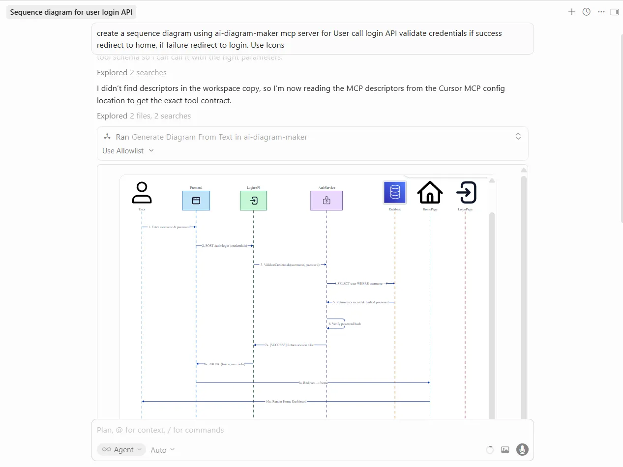
The login flow is easy to scan: clear decision points, clear success and failure branches, and icons that add meaning instead of clutter. This is the kind of output I would be comfortable dropping into a PR or internal doc with little to no editing.
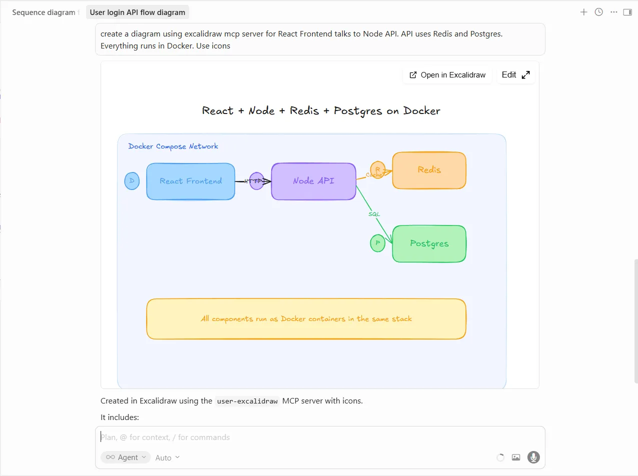
Prompt 2 Results - Architecture Diagram
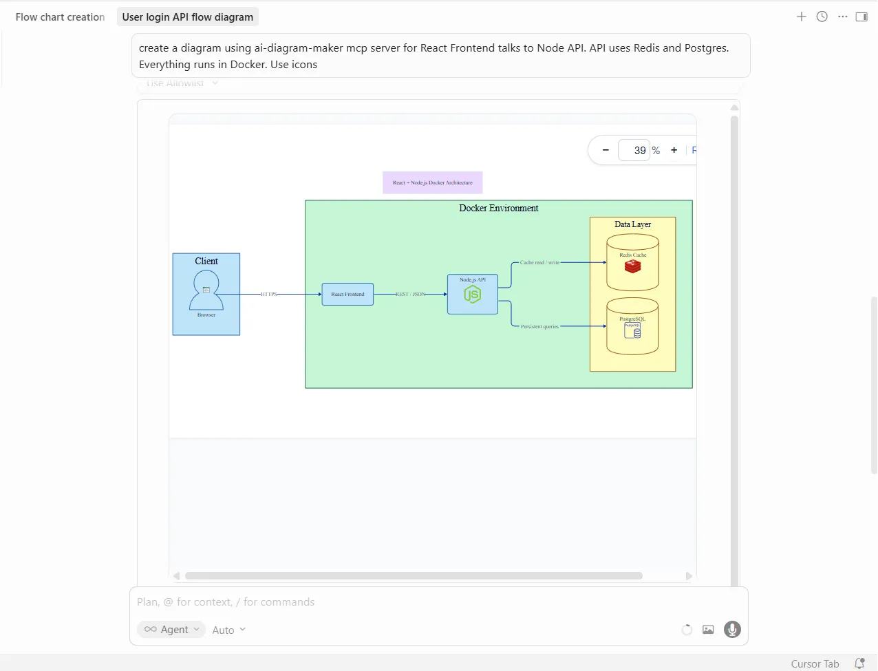
The architecture result is where it pulls ahead. The Docker boundary, service grouping, and recognizable icons make the stack readable at a glance. It communicates structure quickly, which is usually what you want from an architecture diagram.
Where it Excels
- Best when you want strong visual output with minimal prompting.
- Especially good for architecture diagrams, ERDs, sequence diagrams, and anything you plan to share beyond your own notes.
- Flexible if you move between text-to-diagram and code-to-diagram workflows.
Where it Falls Short
- Less ideal if your team wants diagrams to live primarily as plain text in Git.
- Not the best fit when you need heavy manual tweaking in a traditional editor-first workflow.
draw.io: Best if Your Team Already Uses It
draw.io is still one of the safest choices for teams that already rely on diagrams.net. The MCP server generates draw.io XML, so you can start with AI output and then fine-tune it in the editor your team already knows.
Prompt 1 Results - Login Flow Diagram
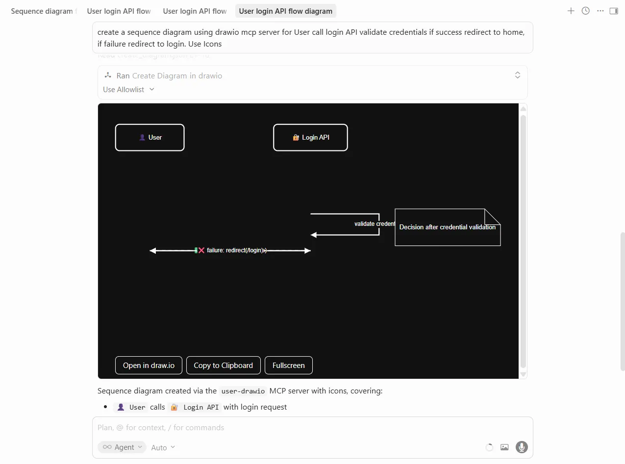
The login flow is clean and conventional. It is readable, structured, and easy to refine later, though it looks more practical than polished out of the box.
Prompt 2 Results - Architecture Diagram
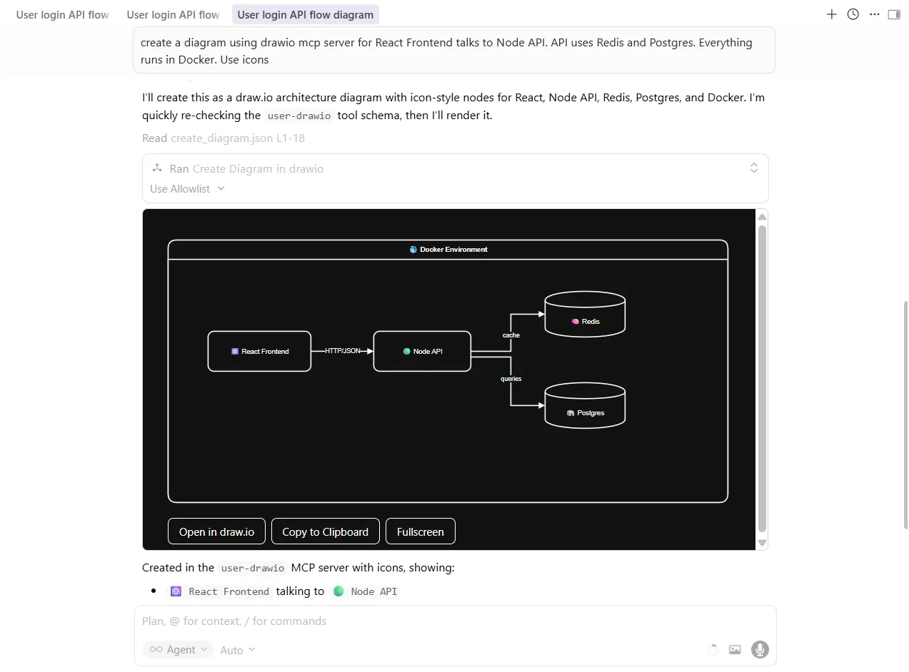
The architecture output is logically grouped and easy to follow. I would trust this format most when the next step is manual editing rather than immediate publishing.
Where it Excels
- Best for teams already using draw.io or diagrams.net.
- Strong option when diagrams need manual refinement after generation.
- Good source format if you want structured files in version control.
Where it Falls Short
- Usually needs more styling work than AI-first tools.
- Icon usage and visual polish are weaker than tools designed around presentation-ready output.
Excalidraw: Great for Early Thinking
Excalidraw keeps the hand-drawn look people already know from whiteboarding sessions. The MCP server leans into that style, which makes the output feel collaborative and unfinished in a useful way.
Prompt 1 Results - Login Flow Diagram
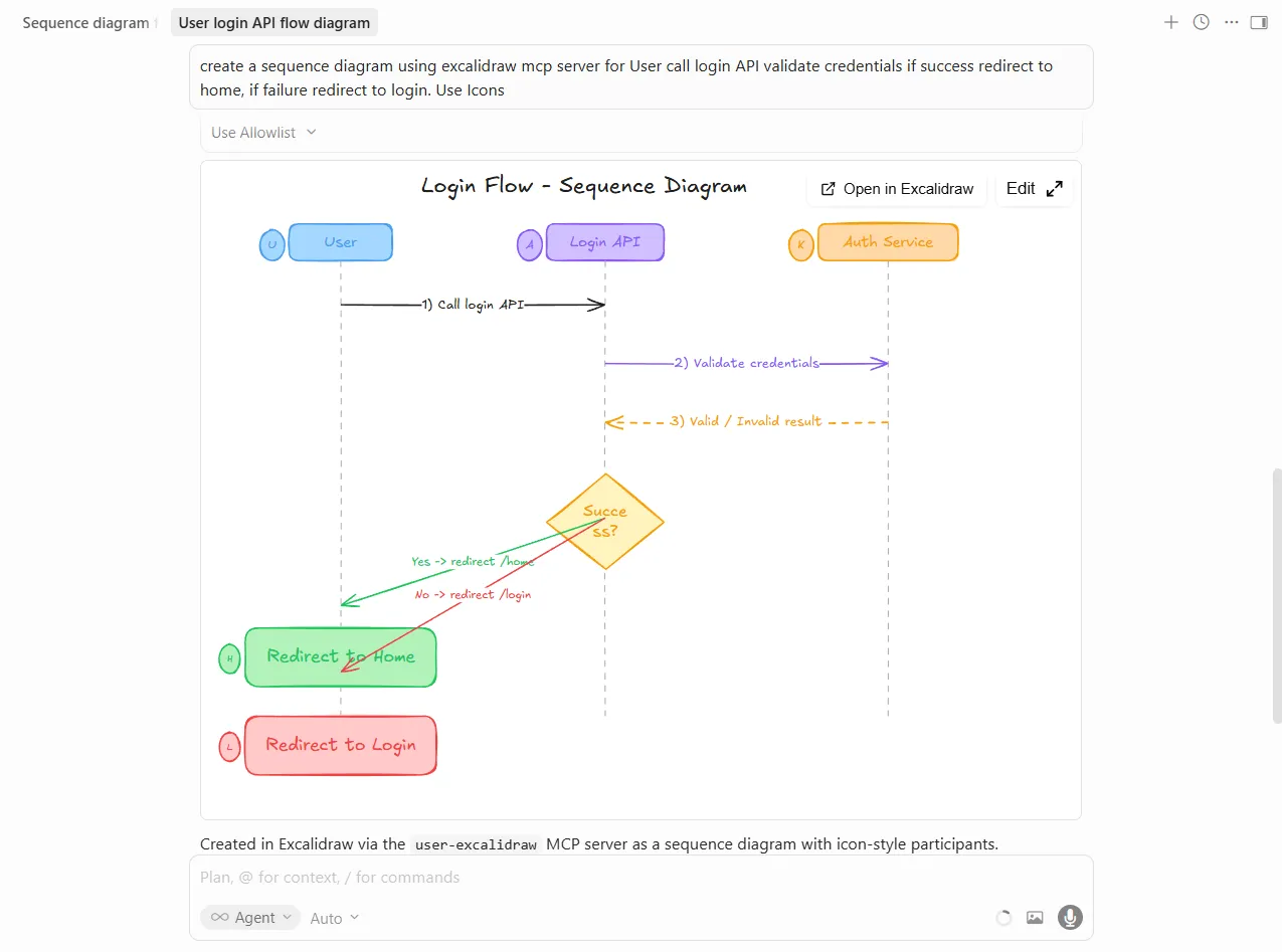
The login flow looks like something you would sketch live in a design review. That is a strength when you want the diagram to invite discussion rather than signal that the design is finalized.
Prompt 2 Results - Architecture Diagram
The architecture version is approachable and easy to talk through. The color coding helps, but the overall style still reads more like a whiteboard than a formal system diagram.
Where it Excels
- Best for brainstorming, collaborative design conversations, and educational content.
- Helpful when you want to communicate “work in progress” instead of “final answer.”
- A comfortable fit for teams that already use Excalidraw for quick thinking.
Where it Falls Short
- Less suitable for polished docs, formal reviews, or stakeholder-facing diagrams.
- If you need clean alignment and a finished visual style, another tool will get you there faster.
Mermaid: Best for Diagram-as-Code
Mermaid is the obvious choice if your team already thinks in Markdown and Git. The MCP server generates Mermaid syntax, which keeps the diagram editable as text and easy to store alongside code.
Prompt 1 Results - Login Flow Diagram
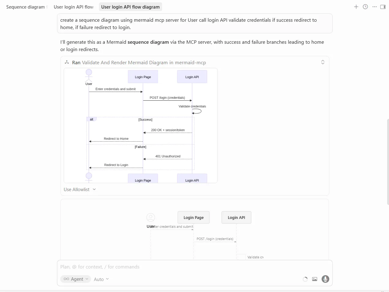
The login flow is clear, minimal, and portable. You do give up icon richness, but you gain a format that is easy to edit and diff.
Prompt 2 Results - Architecture Diagram
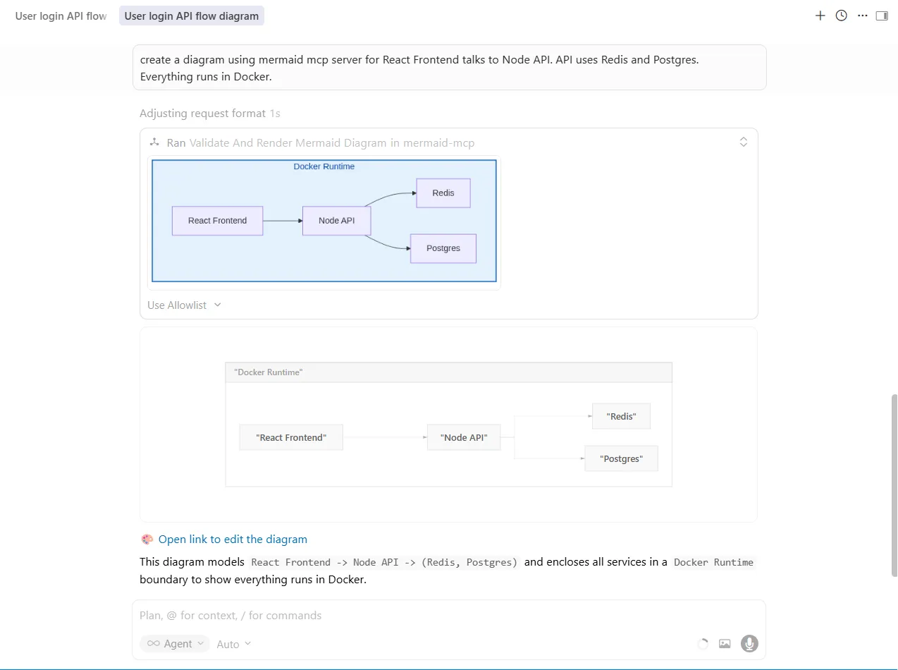
The architecture diagram is straightforward and readable. It does not try to impress visually; it just communicates the system clearly in a format most developer teams can live with long term.
Where it Excels
- Best for documentation-first teams and Markdown-heavy workflows.
- Excellent when you want meaningful diffs and diagrams that live in Git.
- A natural fit if your team already uses Mermaid across docs or READMEs.
Where it Falls Short
- No real native icon support.
- Less appealing when you need a polished visual for slides, docs, or demos without extra effort.
Feature Comparison Table
| Feature | AI Diagram Maker | draw.io | Excalidraw | Mermaid |
|---|---|---|---|---|
| Icon support | Excellent | Basic | Basic | None |
| Visual style | Professional | Structured | Hand-drawn | Minimal |
| Output format | SVG, PNG, D2 | XML, SVG, PNG | JSON, SVG, PNG | Text, SVG, PNG |
| Further editing | Excellent | Excellent | Excellent | Good |
| Version control friendly | Good | Excellent (XML) | Good (JSON) | Excellent (text) |
| Diagram types | 5 core types | Unlimited | Unlimited | 22+ types |
| Best rendering context | Docs and presentations | Technical docs | Brainstorming | Markdown docs |
Which MCP Diagram Tool Should You Choose?
The right choice mostly comes down to what happens after the diagram is generated.
- Choose AI Diagram Maker if you want the best-looking result with the least cleanup.
- Choose draw.io if your team already works in diagrams.net and expects to keep editing there.
- Choose Excalidraw if the diagram is part of a discussion, workshop, or early design pass.
- Choose Mermaid if portability, text-based editing, and Git-friendly diffs matter most.
Final Verdict
If you want one recommendation for the widest range of engineering use cases, I would start with AI Diagram Maker. It gives you the strongest balance of speed, clarity, and visual polish.
That said, there is no need to treat this as a winner-take-all choice. draw.io is still excellent for editor-based refinement, Excalidraw is better for collaborative thinking, and Mermaid is hard to beat for docs that live in Git.
If you want to try the workflow yourself, give AI Diagram Maker a spin and generate a diagram without leaving your editor.